Prompt Details
Model
(claude-4-6-sonnet)
Token size
1,517
Example input
[PRODUCT_TYPE]: meditation and mindfulness mobile app
[TARGET_AUDIENCE]: busy professionals aged 28–45
[BRAND_PERSONALITY]: calm, trustworthy, minimalist, and gently premium
Example output
# Design System: Meditation & Mindfulness Mobile App
> **Document version:** 1.0 — Production Ready
> **Target audience:** Busy professionals, aged 28–45
> **Brand personality:** Calm · Trustworthy · Minimalist · Gently Premium
---
## PHASE 1 — Brand Identity Foundation
### Brand Name Concepts
| Direction | Name | Rationale |
|-----------|------|-----------|
| 1 | **Sōl** | From Latin *sol* (sun) and the concept of soul — warmth, inner light, simplicity. One syllable. Easy to type, easy to remember. |
| 2 | **Luma** | Latin for light. Implies clarity after mental fog. Feels premium without pretension. |
| 3 | **Wren** | A small, unassuming bird famous for its clear, calm song. Organic, quiet confidence. Signals daily ritual, not hustle. |
> **Recommended:** **Luma** — culturally neutral, short, premium-feeling, and maps naturally to the metaphor of mental clarity emerging from noise.
---
### Visual Personality Keywords
`Stillness` · `Clarity` · `Intention` · `Warmth` · `Quiet confidence` · `Refined` · `Grounded`
---
### Emotional Tone
**On first glance, the target audience should feel:**
> *"This was made for someone like me."*
The interface signals immediate calm — no aggressive onboarding CTAs, no gamified pressure. A professional aged 28–45 should sense that this tool respects their intelligence and time. The feeling is closer to opening a well-designed journal than downloading an app. Relief, not excitement.
---
### Competitive Positioning
| Brand | Visual Signature | Where Luma Differs |
|-------|-----------------|-------------------|
| Headspace | Bright orange, cartoonish illustration, high energy | Luma is quieter, more editorial, designed for professionals not beginners |
| Calm | Dark blue, scenic photography, spa aesthetic | Luma is lighter, more minimal, feels personal not generic wellness |
| Ten Percent Happier | Text-heavy, podcast-adjacent | Luma is visually refined, not content-dump |
| Insight Timer | Feature-dense, community-first | Luma is intentionally sparse — fewer features, premium execution |
**Luma's visual differentiator:** A Japanese-influenced minimalism meets Scandinavian editorial design. Think *Kinfolk* magazine meets a focused productivity tool. No photography. No gradients on gradients. Air and intention.
---
## PHASE 2 — Visual Language System
### Color Palette
#### Core Palette
| Role | Name | Hex | Usage Rule |
|------|------|-----|------------|
| **Primary** | Sage Mist | `#6B8F71` | Brand color. Use for primary actions, active states, key UI anchors. Max 20% of any screen. |
| **Secondary** | Warm Stone | `#C8B99A` | Supporting warmth. Use for secondary buttons, illustrations, highlight accents. |
| **Accent** | Pale Amber | `#E8C97A` | Sparingly — one element per screen maximum. Celebration states, streaks, achievement moments only. |
#### Neutral Scale
| Step | Name | Hex | Usage |
|------|------|-----|-------|
| N-50 | Cloud | `#F7F6F3` | App background, card backgrounds |
| N-100 | Linen | `#EDE9E3` | Dividers, skeleton loaders |
| N-300 | Stone | `#B8B0A6` | Placeholder text, disabled labels |
| N-600 | Slate | `#5C5750` | Body text, secondary labels |
| N-900 | Charcoal | `#1E1C1A` | Headings, primary text, icons |
#### Semantic Colors
| Role | Hex | Contrast Note |
|------|-----|---------------|
| **Success** | `#4A7C59` | Passes AA on N-50 background (ratio 5.2:1) |
| **Warning** | `#C08B3C` | Passes AA on N-50 (ratio 4.6:1). Do not use on N-900 text. |
| **Error** | `#B84C4C` | Passes AA on N-50 (ratio 4.8:1). Always pair with icon, never color alone. |
| **Info** | `#4A6E8F` | Passes AA on N-50 (ratio 5.1:1) |
#### Contrast Compliance Notes
- `#1E1C1A` on `#F7F6F3` → **8.9:1 — AAA compliant**
- `#6B8F71` on `#F7F6F3` → **3.9:1 — AA Large text only** — never use as small body text color
- `#C8B99A` on `#F7F6F3` → **1.8:1 — decorative use only**, never for readable text
- Pale Amber `#E8C97A` must always appear on `#1E1C1A` or N-900 surface for legibility
- All interactive elements must meet 3:1 minimum against adjacent colors (WCAG 2.1 non-text contrast)
---
### Typography System
#### Heading Font: **Cormorant Garamond**
A refined serif with old-world warmth and generous whitespace. Signals premium without coldness.
| Level | Weight | Size (Mobile) | Size (Desktop) | Usage |
|-------|--------|--------------|----------------|-------|
| H1 | 300 Light | 32px / 2rem | 48px / 3rem | Screen titles, session names |
| H2 | 400 Regular | 24px / 1.5rem | 36px / 2.25rem | Section headers |
| H3 | 500 Medium | 20px / 1.25rem | 28px / 1.75rem | Card titles, modal headers |
| H4 | 500 Medium | 16px / 1rem | 20px / 1.25rem | List item titles, labels with hierarchy |
#### Body Font: **DM Sans**
A geometric sans-serif with humanist warmth. Clean without being cold.
| Role | Weight | Size | Line Height | Usage |
|------|--------|------|-------------|-------|
| Body Large | 400 | 16px | 1.6 | Primary reading text, descriptions |
| Body Default | 400 | 14px | 1.6 | Standard UI copy |
| Body Small | 400 | 13px | 1.5 | Secondary information |
#### Caption & Label Rules
- **Labels (UI elements):** DM Sans 500, 12px, 1.4 line-height, letter-spacing +0.02em
- **Captions:** DM Sans 400, 12px, N-600 color only — never N-900 to preserve hierarchy
- **Time indicators / metadata:** DM Sans 400, 11px, N-300 — ghost presence only
- **All-caps labels:** Permitted at 11px with +0.08em tracking, max 3 words
#### Font Pairing Rationale
Cormorant Garamond brings the heritage, warmth, and quiet luxury that professionals associate with trusted, considered things — a good book, a quality journal. DM Sans provides the legibility and neutrality needed for UI copy at small sizes without fighting the heading font for attention. The contrast between serif and geometric sans creates natural hierarchy without additional design work.
---
### Spacing & Layout
#### Base Unit: **4px**
All spacing values are multiples of 4px.
#### Spacing Scale
| Token | Value | Usage |
|-------|-------|-------|
| `space-xs` | 4px | Icon padding, tight inline gaps |
| `space-sm` | 8px | Between related elements (label → input) |
| `space-md` | 16px | Internal card padding, section breathing room |
| `space-lg` | 24px | Between distinct components |
| `space-xl` | 40px | Section breaks, screen-level vertical rhythm |
| `space-2xl` | 64px | Hero spacing, large breathing room |
#### Grid System
| Context | Columns | Gutter | Margin |
|---------|---------|--------|--------|
| Mobile (< 390px) | 4 | 12px | 16px |
| Mobile (390–767px) | 4 | 16px | 20px |
| Tablet (768–1023px) | 8 | 20px | 32px |
| Desktop (≥ 1024px) | 12 | 24px | 48px |
#### Breakpoints
| Name | Range | Notes |
|------|-------|-------|
| `mobile-sm` | < 390px | Older iPhones, tight layout |
| `mobile` | 390–767px | Primary design target |
| `tablet` | 768–1023px | iPad portrait, secondary |
| `desktop` | ≥ 1024px | Web companion / settings only |
> **Layout philosophy:** Design mobile-first. The app is a single-column experience. Do not introduce complexity before 768px. Whitespace is not wasted space — it is the product.
---
### Iconography & Illustration Style
#### Icon Style: **Refined Outline with 1.5px stroke**
- Stroke weight: 1.5px (never 1px — too fragile; never 2px — too heavy)
- Corner radius on strokes: 2px (softens without going bubbly)
- Line caps: Round
- Size grid: 16px / 20px / 24px only — no intermediate sizes
- No filled icons except for active/selected states (where the icon fills with Primary color)
- Never mix outline and filled icons in the same navigation context
#### Illustration Direction: **Abstract Minimal / Organic Geometry**
Inspired by Japanese Zen garden raking patterns, water ripples, and breath cycles visualized as concentric forms.
- **Style:** Monoline or duotone (Sage Mist + Warm Stone), never full-color illustration
- **Forms:** Circles, soft arcs, breath-wave curves, concentric rings
- **Never:** Cartoon characters, people with faces, photorealism, stock image aesthetic
- **Texture:** Subtle paper grain overlay on illustrations (5–8% opacity) for warmth
#### Dos and Don'ts
| ✅ Do | ❌ Don't |
|-------|---------|
| Use breath-circle animations for loading states | Use spinner icons |
| Illustrate time with soft arc progressions | Use digital clock / stopwatch UI metaphors |
| Let whitespace carry meaning | Fill empty space with decorative clutter |
| Use icons only when they add meaning | Decorate text that already communicates |
| Animate on interaction completion, not initiation | Use animations to fill time |
---
## PHASE 3 — UI Component Rules
### 1. Primary Button
**Visual Description:**
Pill-shaped (border-radius: 100px). Sage Mist fill (`#6B8F71`). White label in DM Sans 500, 15px, letter-spacing +0.01em. Height: 52px on mobile. Minimum width: 160px. No border. Subtle shadow: `0 2px 8px rgba(107, 143, 113, 0.25)`.
**States:**
- **Default:** Sage Mist fill, white text
- **Hover / Press:** 8% darker (`#5F8065`), shadow increases to `0 4px 16px rgba(107, 143, 113, 0.35)`
- **Disabled:** N-100 background, N-300 text, no shadow, cursor: not-allowed
- **Loading:** Label replaced by three-dot breath pulse animation in white
**When to use:** Primary single action per screen. "Begin Session", "Continue", "Save".
**When NOT to use:** Never two Primary buttons on the same screen. Never for destructive actions.
**Accessibility:** Minimum touch target 44×44px. Focus ring: 2px offset, Sage Mist color. Label must describe the action, not generic "Click here".
---
### 2. Input Field
**Visual Description:**
Height 52px. Background N-50. Border: 1px solid N-100. Border-radius: 12px. Label: DM Sans 400 12px, N-600, sits above the field (not floating placeholder). Placeholder text: N-300. Internal padding: 16px horizontal.
**States:**
- **Default:** N-100 border
- **Focus:** Border becomes 1.5px Sage Mist. Subtle glow: `0 0 0 3px rgba(107, 143, 113, 0.15)`
- **Filled:** Border returns to N-100, text becomes N-900
- **Error:** Border: 1.5px Error red `#B84C4C`. Error message appears 4px below in DM Sans 12px, Error color, preceded by ⚠ icon
- **Disabled:** Background N-100, text N-300, no interaction
**When to use:** All text entry — settings, journal prompts, search.
**When NOT to use:** Never use for binary choices (use toggle). Never use for date/time (use dedicated picker).
**Accessibility:** Label is always visible — never use placeholder-only pattern. Error messages reference the field by name.
---
### 3. Card / Container
**Visual Description:**
Background: White (`#FFFFFF`). Border-radius: 20px. Padding: 20px. Shadow: `0 1px 4px rgba(30, 28, 26, 0.06), 0 4px 16px rgba(30, 28, 26, 0.04)` — a two-layer shadow for depth without drama. No border. Hover state (interactive cards only): shadow deepens slightly, 150ms ease.
**Variants:**
- **Session card:** 20px radius, full shadow, 20px padding
- **Stat/summary card:** 16px radius, lighter shadow, 16px padding
- **Inset/embedded card:** N-50 background (no shadow), 12px radius — for nested content
**When to use:** Grouping related content, session tiles, progress blocks.
**When NOT to use:** Never nest full shadow cards inside shadow cards. Never use card borders AND shadow together.
**Accessibility:** Interactive cards must have a focusable element and visible focus ring. Do not rely on hover-only to reveal actions.
---
### 4. Navigation Bar (Bottom Tab Bar — Mobile Primary)
**Visual Description:**
Fixed bottom. Height 64px + safe area inset. Background: White, top border 1px N-100. 4 icons maximum. Icon size: 24px. Label: DM Sans 400 10px below icon. 4px gap between icon and label.
**Active State:**
Icon fills with Sage Mist. Label becomes N-900 at 500 weight. No background pill/indicator — the color change is sufficient. Subtle upward micro-animation (2px translate Y) on tab press.
**Inactive State:** Icon outline, N-300 color. Label N-300.
**Mobile behavior:** Always visible. Hides during active meditation session (fullscreen mode). Returns on swipe-up or session end.
**When to use:** Primary app navigation only. Max 4 destinations.
**When NOT to use:** Never use for secondary flows, settings sub-navigation, or modals. Never more than 5 items.
**Accessibility:** Each tab has an aria-label. Active state communicated via aria-selected. Tab order matches visual left-to-right order.
---
### 5. Badge / Tag
**Visual Description:**
Height: 24px. Padding: 4px 10px. Border-radius: 100px (full pill). DM Sans 500, 11px, letter-spacing +0.04em, all-caps.
**Color Variants:**
| Variant | Background | Text | Use case |
|---------|-----------|------|----------|
| Sage (default) | `rgba(107,143,113,0.12)` | `#4A7A50` | Category, session type |
| Stone | `rgba(200,185,154,0.2)` | `#7A6A52` | Duration, neutral metadata |
| Amber | `rgba(232,201,122,0.2)` | `#8A6E20` | Streak, achievement |
| Error | `rgba(184,76,76,0.1)` | `#B84C4C` | Expiry, warning states |
**When to use:** Short metadata labels: session length, category tag, streak count.
**When NOT to use:** Never for interactive filters (use a chip/toggle component). Never for sentences longer than 2 words.
**Accessibility:** Never convey meaning by color alone. If the badge communicates status, use a visible text label, not just color.
---
### 6. Modal / Overlay
**Visual Description:**
Backdrop: `rgba(30, 28, 26, 0.5)` with `backdrop-filter: blur(4px)`. Modal sheet: White, border-radius 24px top corners only (bottom sheet pattern for mobile). Drag handle: 32px × 4px, N-300, centered at top, 12px from edge.
**Animation:**
- **Enter:** Slides up from bottom, 300ms, `cubic-bezier(0.16, 1, 0.3, 1)` (ease-out spring feel)
- **Exit:** Slides down to bottom, 220ms, `cubic-bezier(0.4, 0, 1, 1)`
- **Backdrop:** Fades in 200ms, fades out 180ms
**Close behavior:** Tap backdrop, drag down > 30% of modal height, or dedicated close icon (top-right, 24px × 24px, N-300 color, becomes N-900 on hover).
**When to use:** Contextual actions, confirmation dialogs, session detail previews, settings subpanels.
**When NOT to use:** Never for primary navigation. Never for content that requires more than 80% of screen height — use a new screen instead. Never stack modals.
**Accessibility:** Focus traps within modal when open. ESC key closes (desktop). aria-modal="true". Background content gets aria-hidden="true". Return focus to trigger element on close.
---
## PHASE 4 — Design Tokens Export
```
/* ─────────────────────────────────────────
LUMA DESIGN TOKENS v1.0
───────────────────────────────────────── */
/* COLORS — Brand */
--color-primary: #6B8F71 — Sage Mist; primary actions, active states
--color-primary-hover: #5F8065 — Sage Mist darkened 8%; hover/press state
--color-primary-subtle: rgba(107,143,113,0.12) — Sage tint; badge backgrounds, focus rings
--color-secondary: #C8B99A — Warm Stone; supporting accents, illustrations
--color-accent: #E8C97A — Pale Amber; achievement, streak, one-per-screen max
/* COLORS — Neutrals */
--color-neutral-50: #F7F6F3 — Cloud; app background
--color-neutral-100: #EDE9E3 — Linen; dividers, skeleton loaders, disabled backgrounds
--color-neutral-300: #B8B0A6 — Stone; placeholder text, inactive icons
--color-neutral-600: #5C5750 — Slate; body text, secondary labels
--color-neutral-900: #1E1C1A — Charcoal; headings, primary text
/* COLORS — Semantic */
--color-success: #4A7C59 — Positive feedback, completion states
--color-warning: #C08B3C — Caution states, expiry indicators
--color-error: #B84C4C — Validation errors, destructive states
--color-info: #4A6E8F — Informational messages, tooltips
/* COLORS — Surface */
--color-surface-default: #FFFFFF — Cards, modals, sheets
--color-surface-muted: #F7F6F3 — App background (same as neutral-50)
--color-surface-overlay: rgba(30,28,26,0.5) — Modal backdrop
/* ─── TYPOGRAPHY — Font Families ─── */
--font-heading: 'Cormorant Garamond', Georgia, serif
--font-body: 'DM Sans', -apple-system, sans-serif
/* TYPOGRAPHY — Heading Sizes */
--font-size-h1: 2rem — 32px mobile; screen titles
--font-size-h2: 1.5rem — 24px mobile; section headers
--font-size-h3: 1.25rem — 20px mobile; card titles
--font-size-h4: 1rem — 16px mobile; list item titles
/* TYPOGRAPHY — Body Sizes */
--font-size-body-lg: 1rem — 16px; primary reading text
--font-size-body: 0.875rem — 14px; standard UI copy
--font-size-body-sm: 0.8125rem — 13px; secondary information
--font-size-caption: 0.75rem — 12px; labels, captions
--font-size-micro: 0.6875rem — 11px; metadata, nav labels
/* TYPOGRAPHY — Weights */
--font-weight-light: 300 — Heading display use
--font-weight-regular: 400 — Body, captions
--font-weight-medium: 500 — Labels, active states, H3–H4
--font-weight-semibold: 600 — Rarely; emphasis only
/* TYPOGRAPHY — Line Heights */
--line-height-heading: 1.2 — Tight for display text
--line-height-body: 1.6 — Comfortable reading
--line-height-label: 1.4 — UI labels
/* TYPOGRAPHY — Letter Spacing */
--letter-spacing-tight: -0.02em — Large headings
--letter-spacing-normal: 0 — Body text
--letter-spacing-label: +0.02em — UI labels
--letter-spacing-caps: +0.08em — All-caps micro labels
/* ─── SPACING ─── */
--space-xs: 4px — Icon padding, tight inline gaps
--space-sm: 8px — Between related elements
--space-md: 16px — Internal card padding, standard gaps
--space-lg: 24px — Between distinct components
--space-xl: 40px — Section breaks
--space-2xl: 64px — Hero spacing, screen-level breathing room
/* ─── BORDER RADIUS ─── */
--radius-sm: 8px — Small chips, tooltips
--radius-md: 12px — Input fields, small cards
--radius-lg: 20px — Standard cards, session tiles
--radius-xl: 24px — Modals, bottom sheets
--radius-full: 100px — Buttons (pill), badges, toggles
/* ─── SHADOWS ─── */
--shadow-xs: 0 1px 2px rgba(30,28,26,0.05)
— Subtle separation, nav bar top border replacement
--shadow-sm: 0 1px 4px rgba(30,28,26,0.06), 0 4px 16px rgba(30,28,26,0.04)
— Standard card shadow
--shadow-md: 0 4px 12px rgba(30,28,26,0.08), 0 8px 32px rgba(30,28,26,0.06)
— Hover state, elevated cards
--shadow-lg: 0 8px 24px rgba(30,28,26,0.10), 0 20px 60px rgba(30,28,26,0.08)
— Modals, bottom sheets
--shadow-primary: 0 2px 8px rgba(107,143,113,0.25)
— Primary button default shadow
--shadow-primary-hover: 0 4px 16px rgba(107,143,113,0.35)
— Primary button hover shadow
/* ─── TRANSITIONS ─── */
--duration-fast: 150ms — Micro-interactions, color changes
--duration-normal: 220ms — State transitions, hover effects
--duration-slow: 300ms — Modal entry, page transitions
--easing-default: cubic-bezier(0.4, 0, 0.2, 1) — Standard ease
--easing-spring: cubic-bezier(0.16, 1, 0.3, 1) — Modal entry
--easing-exit: cubic-bezier(0.4, 0, 1, 1) — Modal exit
/* ─── Z-INDEX LAYERS ─── */
--z-base: 0 — Default stacking
--z-raised: 10 — Elevated cards, floating elements
--z-sticky: 100 — Sticky headers, nav bar
--z-overlay: 200 — Backdrop overlays
--z-modal: 300 — Modals, bottom sheets
--z-toast: 400 — Toast notifications
--z-tooltip: 500 — Tooltips (always on top)
/* ─── ICON SIZES ─── */
--icon-sm: 16px — Inline icons, badge icons
--icon-md: 20px — Form field icons
--icon-lg: 24px — Navigation icons, primary UI icons
/* ─── COMPONENT — Button ─── */
--btn-height: 52px
--btn-min-width: 160px
--btn-padding-h: 24px
--btn-radius: var(--radius-full)
--btn-font-size: 0.9375rem — 15px
--btn-font-weight: 500
--btn-letter-spacing: +0.01em
/* ─── COMPONENT — Input ─── */
--input-height: 52px
--input-padding-h: 16px
--input-radius: var(--radius-md)
--input-border: 1px solid var(--color-neutral-100)
--input-border-focus: 1.5px solid var(--color-primary)
--input-focus-ring: 0 0 0 3px rgba(107,143,113,0.15)
/* ─── COMPONENT — Navigation Bar ─── */
--nav-height: 64px
--nav-label-size: 0.625rem — 10px
--nav-icon-size: var(--icon-lg)
--nav-gap: 4px — icon-to-label gap
```
---
## PHASE 5 — Style Guide Summary
### Brand Essence
> **Luma gives busy professionals a daily moment of genuine stillness — built with the same care and precision they bring to everything else.**
---
### Color Palette Visual Reference
```
┌─────────────────────────────────────────────────────────────┐
│ PRIMARY SECONDARY ACCENT NEUTRAL │
│ │
│ ████████ ████████ ████████ ████████ │
│ Sage Mist Warm Stone Pale Amber Cloud │
│ #6B8F71 #C8B99A #E8C97A #F7F6F3 │
│ │
│ ████████ ████████ ████████ ████████ │
│ (hover) Linen Charcoal Slate │
│ #5F8065 #EDE9E3 #1E1C1A #5C5750 │
│ │
│ SEMANTIC │
│ ████ ████ ████ ████ │
│ Success Warning Error Info │
│ #4A7C59 #C08B3C #B84C4C #4A6E8F │
└─────────────────────────────────────────────────────────────┘
```
**Color philosophy:** Sage Mist is nature without being cliché. Warm Stone adds human warmth. Pale Amber appears only to reward. The neutral scale is warm-tinted (never cold gray) to keep the interface from feeling clinical.
---
### Typography Specimen
```
Cormorant Garamond Light 300
━━━━━━━━━━━━━━━━━━━━━━━━━━━━━━━
H1 — 32px / 2rem
Begin your morning
H2 — 24px / 1.5rem
Today's practice
H3 — 20px / 1.25rem
Breathing Exercise
─────────────────────────────────
DM Sans Regular 400
─────────────────────────────────
Body — 14px / 0.875rem / line-height 1.6
Take a moment. Even five minutes of focused
breathing can shift how you move through the rest
of your day.
LABEL — 11PX / DM SANS 500 / +0.08EM TRACKING
SESSION · 8 MINUTES · BEGINNER
```
---
### Voice & Tone
#### ✅ 3 Dos
1. **Speak at eye level.** These are accomplished professionals. Treat them as capable adults who have chosen to slow down, not as beginners who need to be led.
2. **Be specific about time.** "8 minutes" lands better than "quick." Respect that their time is their most valuable resource.
3. **Use the language of invitation, not obligation.** "When you're ready" not "You should." "Consider" not "You must."
#### ❌ 3 Don'ts
1. **Never use wellness jargon without meaning.** "Align your chakras," "manifest your best self," "unlock your potential" — these erode trust with skeptical professionals.
2. **Never use exclamation marks in UI copy.** They break the calm register the brand is built on. One exception: genuine achievement moments, maximum once per session.
3. **Never create false urgency.** No "Only 3 spots left!" or "Complete before midnight." This brand earns loyalty through consistency, not pressure.
---
### Logo Usage Rules
1. **Clear space:** Minimum clear space equal to the cap-height of the wordmark on all four sides.
2. **Minimum size:** 80px wide on screen, 20mm in print — below this, the letterform detail is lost.
3. **Approved versions:** Full-color on white/light surfaces; white knock-out on Sage Mist or Charcoal; single-color Charcoal on light neutrals.
4. **Forbidden:** Never place on photography. Never stretch, rotate, or apply drop shadows. Never use the wordmark in body copy.
5. **App icon:** The mark alone (no wordmark) at 1024×1024px, Sage Mist background, white symbol — optimized for home screen recognition at 60px.
---
### The Single Design Rule That Must Never Be Broken
> **No screen may have more than one visual focal point.**
Every screen earns exactly one moment of emphasis — one hero element, one primary CTA, one piece of key information that the eye lands on first. Everything else recedes. This is not a layout preference. It is the product.
When multiple elements compete for attention, the stillness is broken. When stillness is broken, the product has failed its only job.
---
## ✅ Before You Ship: 10 Design Decisions to Verify
```
LUMA DESIGN SYSTEM — PRE-LAUNCH CHECKLIST
[ ] 1. COLOR CONTRAST
Every text element passes WCAG AA (4.5:1 for body, 3:1 for large text).
Run automated check against every screen, not just components.
[ ] 2. ONE FOCAL POINT PER SCREEN
Review every screen: can you identify the single most important element
in under 2 seconds? If not, reduce until you can.
[ ] 3. TOUCH TARGETS
Every interactive element is minimum 44×44px.
Check tab bar icons, close buttons, and inline links especially.
[ ] 4. PALE AMBER USAGE
Accent color appears maximum once per screen.
Do a global audit — it should feel like a reward, not decoration.
[ ] 5. FONT LOADING STRATEGY
Cormorant Garamond and DM Sans load with font-display: swap.
Fallback font stack defined and tested at each heading level.
[ ] 6. SAFE AREA COMPLIANCE
Bottom navigation respects device safe area insets (notch, home indicator).
Test on iPhone SE, iPhone 14 Pro Max, and Android reference device.
[ ] 7. ANIMATION ACCESSIBILITY
All animations respect prefers-reduced-motion media query.
Breathing animations and session timers have static fallback states.
[ ] 8. MODAL FOCUS TRAP
Every modal/bottom sheet traps focus, returns focus on close,
and aria-hides background content. Test with keyboard navigation.
[ ] 9. NO ORPHANED EXCLAMATION MARKS
Search codebase/design files for "!" in UI copy strings.
Only achievement celebration states are permitted.
[ ] 10. TYPOGRAPHY HIERARCHY AUDIT
On every screen: heading font for display, DM Sans for all UI copy.
No mixing within a single component. No body text in Cormorant.
```
---
*Luma Design System — v1.0 — Ready for implementation.*
*Maintain this document alongside the component library. When tokens change, update here first.*
Or get it with Select10 Select prompts/mo — under $2 each
Learn more
 Instant access
 Commercial use
 Money‑back
By purchasing this prompt, you agree to our terms of service
2
Favorites
21
Views
CLAUDE-4-6-SONNET
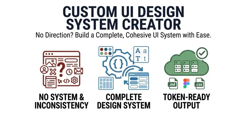
No design direction, no consistency, no system. This prompt builds a complete visual identity for any product — color palette, typography, spacing, UI component rules, and design tokens — shaped around your audience and brand personality.
🎨 Full color + type system
🧩 6 UI component specs
📐 Token-ready for Figma or CSS
✅ Output delivered as a .md file
👉 3 inputs. One complete design system.
...more
Added over 1 month ago