

Prompt Details
Model
(claude-5-opus)
Token size
1,111
Example input
[PACK_THEME]: fintech dashboard for freelance invoicing
[ICON_COUNT]: 12
[VISUAL_STYLE]: line
[BRAND_MOOD]: precise, calm, technical
Example output
Pack Concept
The pack serves a solo freelancer moving through one recurring loop: draft an invoice, send it, wait, get paid, set money aside for tax. Every icon belongs to that loop, which is the unifying idea — each mark is built from a single continuous stroke path that starts and ends on the 24 px grid, so the whole set reads like one instrument panel rather than twelve decorations. Precise becomes a fixed 1.5 px stroke with zero variance and every terminal landing on a whole-pixel coordinate. Calm becomes a 2 px outer corner radius and a hard ban on diagonal motion lines, exclamation marks, or any decorative burst. Technical becomes flat orthogonal construction with only 45-degree diagonals permitted, so nothing in the set looks illustrative.
Anti-goal: the generic finance-icon direction of stacked coins, dollar bills, and piggy banks, which describes money in the abstract instead of describing the freelancer's actual document workflow.
Style Specification
Master artboard: 24 px by 24 px, live area 20 px by 20 px, minimum padding 2 px on all sides
Keyline square: 20 px by 20 px, used for document and card forms
Keyline circle: 20 px diameter, used for status and currency forms
Keyline landscape rectangle: 20 px by 16 px, used for bank, chart, and ledger forms
Keyline portrait rectangle: 16 px by 20 px, used for invoice and receipt forms
Stroke weight: 1.5 px on all paths, permitted variance 0 px
Outer corner radius: 2 px; inner corner radius: 1 px; radius applies to every corner without exception
Terminals: butt caps, squared, no rounded ends
Joints: mitre joins at 90 degrees, bevel joins at 45 degrees
Permitted diagonal angles: 45 degrees only
Minimum counter and negative space: 2 px between any two parallel strokes
Fill and stroke relationship: no fills; every form is stroke-only, and enclosed shapes read as containers not solids
Color roles: primary stroke, accent stroke; maximum 2 roles per icon, accent used only for the single element carrying status meaning
Optical correction: circular forms drawn at 20.5 px diameter to match the 20 px square optically; 45-degree strokes drawn at 1.6 px to match 1.5 px orthogonal strokes optically
Suggested placeholder palette: primary stroke #2B3340 suggested placeholder, accent stroke #1E6FD9 suggested placeholder
Icon Roster (12)
Number Icon Name Metaphor Composition Note Ambiguity Risk
— Invoicing Core — — —
1 New Invoice Portrait document sheet with a plus at lower right Portrait rectangle keyline, weight centred, plus sits inside the 20 px live area Generic new file
2 Send Invoice Document sheet with a paper plane departing its upper right corner Portrait rectangle keyline, weight shifted left, plane occupies upper right quadrant Email send
3 Invoice Paid Document sheet with a checkmark overlapping its lower right corner Portrait rectangle keyline, weight centre-left, check breaks the sheet edge Task complete
4 Overdue Notice Document sheet with a clock face overlapping its lower right corner Portrait rectangle keyline, clock at 20 percent of artboard area Scheduled send
— Money Movement — — —
5 Payout Bank card exiting downward through an open tray mouth Landscape rectangle keyline, weight low, card tilted 45 degrees Download
6 Bank Link Two-column bank facade joined to a card by a short link bar Landscape rectangle keyline, weight evenly split left and right Building or store
7 Currency Swap Two opposing arrows curving between two open circles Circle keyline, rotational balance, arrows on 45-degree tangents Refresh or sync
— Client And Time — — —
8 Client Card Contact card with a single head silhouette at left and two text rules at right Landscape rectangle keyline, weight left Profile settings
9 Time Log Clock face with a horizontal bar running out of its right edge Circle keyline, weight centre, bar extends 6 px Timer or alarm
10 Recurring Cycle Closed loop arrow circling a small calendar square Circle keyline enclosing a 10 px square Sync or reload
— Insight — — —
11 Revenue Trend Ascending step line over a baseline axis Landscape rectangle keyline, weight rising left to right Analytics chart
12 Tax Reserve Open-lid container with a percent mark suspended above it Portrait rectangle keyline, weight low, percent in upper third Discount tag
Naming And File Convention
Files use lowercase kebab-case in the pattern icon-[name]-[style]-[size].svg. Examples: icon-new-invoice-line-24.svg, icon-send-invoice-line-24.svg, icon-currency-swap-line-16.svg, icon-tax-reserve-line-32.svg.
Folder structure: /icons/line/16/, /icons/line/24/, /icons/line/32/, with one flat directory per size and no nesting by cluster.
State variants suffix before the style token: icon-invoice-paid-active-line-24.svg, icon-invoice-paid-disabled-line-24.svg. Only active and disabled are permitted suffixes in this set.
Inside the source file, the top-level group is named to match the file stem. Sub-groups are named container, mark, accent. Individual paths are named path-01 upward in draw order. No group may be named Group 1 or left at the editor default.
Export Specification
Source format is SVG authored on the 24 px master. Export formats are SVG for web and PDF for print handoff. The set ships at 16 px, 24 px, and 32 px. The 16 px size is hand-hinted: strokes are redrawn at 1 px and detail elements such as the two text rules in Client Card and the step count in Revenue Trend are reduced. The 24 px and 32 px sizes are scaled from the master without redrawing.
Strokes are preserved as strokes, not outlined. The consequence is that stroke weight must be controlled by CSS or the consuming component, so a scaled icon at 48 px will show a 3 px stroke unless vector-effect="non-scaling-stroke" or an explicit stroke width is applied downstream.
The viewBox is 0 0 24 24 at every ship size. Attribute strategy: fill="none" on the root, stroke="currentColor" on all primary paths, and the accent path carries a named class rather than a hardcoded stroke value so it can inherit a second color role.
Accessibility: decorative icons carry aria-hidden="true" and no title element. Meaningful icons carry role="img" and a <title> element whose text matches the Icon Name column, and must not rely on the accent color role alone to convey status.
Consistency Ruleset
Every path in the icon uses a 1.5 px stroke; measure any two paths and they must be identical.
Every terminal is a butt cap; no rounded or extended cap appears anywhere in the file.
Every outer corner measures 2 px radius and every inner corner measures 1 px radius.
Every diagonal in the icon sits at exactly 45 degrees; no other angle appears.
No stroke crosses the 2 px padding boundary of the 24 px artboard.
No two parallel strokes sit closer than 2 px apart.
The icon contains no fill attribute other than none.
At most one element in the icon carries the accent color role.
Every path endpoint lands on a whole-pixel or half-pixel coordinate.
The icon contains no motion lines, sparkles, exclamation marks, or shadow elements.
Ambiguity Watchlist
New Invoice versus generic new file: add two horizontal text rules inside the sheet body so it reads as a filled-in document rather than a blank page.
Send Invoice versus email send: keep the document sheet as the dominant form at roughly 70 percent of the mark and shrink the plane so the plane reads as the action, not the subject.
Invoice Paid versus task complete: let the checkmark break the sheet outline rather than sitting inside it, so the sheet stays the primary form.
Overdue Notice versus scheduled send: draw the clock hands at a past-due position such as 9:15 rather than 12:00, and place the clock overlapping the sheet corner rather than beside it.
Payout versus download: replace the plain downward arrow with a card form exiting a tray mouth, so the object moving is money, not a file.
Bank Link versus building or store: reduce the facade to exactly two columns and a flat lintel with no roof pitch, and attach the link bar so the card is visible.
Currency Swap versus refresh or sync: terminate the two arrows on open circles rather than closing them into a full ring, so the mark reads as exchange between two things.
Client Card versus profile settings: place the head silhouette inside the card outline rather than centred alone, and keep both text rules.
Time Log versus timer or alarm: omit the alarm bell and the top stem, and extend the horizontal bar out of the dial to signal logged duration.
Recurring Cycle versus sync or reload: keep the enclosed calendar square visible at 10 px so the loop clearly circles a date, not nothing.
Revenue Trend versus analytics chart: draw the line as discrete steps rather than a smooth curve, and include the baseline axis so it pairs with the ledger forms.
Tax Reserve versus discount tag: keep the container lid open and the percent mark detached above it, so the mark reads as setting aside rather than applying a rate.

 Instant access
 Commercial use
 Money‑back
By purchasing this prompt, you agree to our terms of service
5
Views
CLAUDE-5-OPUS


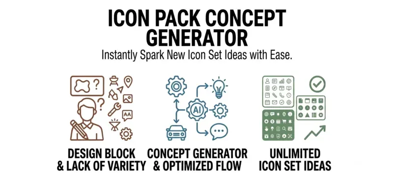
🎨 Turn a single theme into a full icon pack concept: pack statement, style spec, per-icon roster with metaphors and ambiguity flags, naming rules, export specs, and a consistency ruleset. Four inputs — theme, icon count, visual style, brand mood. Built for designers, indie hackers, and stock creators who need a coherent, production-ready set instead of scattered one-off icons. ✏️
...more
Added over 1 month ago
