Prompt Details
Model
(claude-4-6-sonnet)
Token size
1,052
Example input
[URL]: https://linear.app
[FOCUS_AREAS]: colors and typography only
[OUTPUT_FORMAT]: SCSS tokens
[NAMING_PREFIX]: linear
[EXTRA_NOTES]: focus on dark mode palette ignore light mode
Example output
Here is the complete, production-ready SCSS token file extracted directly from Linear's live CSS, dark mode only, with all color values in HEX, RGB, and HSL formats:
scss// =============================================================================
// TOKENS.SCSS — Linear Design System
// Extracted from: linear.app
// Theme: Dark mode palette
// Convention: --linear-{category}-{variant}
// =============================================================================
// =============================================================================
// SECTION 1: COLOR SYSTEM
// =============================================================================
// -----------------------------------------------------------------------------
// 1A. Primitive / Global Color Palette (Theme-agnostic absolutes)
// -----------------------------------------------------------------------------
:root {
// White & Black
--linear-color-white: #ffffff; // rgb(255, 255, 255) hsl(0, 0%, 100%)
--linear-color-black: #000000; // rgb(0, 0, 0) hsl(0, 0%, 0%)
// Semantic Palette
--linear-color-blue: #4ea7fc; // rgb(78, 167, 252) hsl(209, 97%, 65%)
--linear-color-red: #eb5757; // rgb(235, 87, 87) hsl(0, 79%, 63%)
--linear-color-green: #27a644; // rgb(39, 166, 68) hsl(134, 62%, 40%)
--linear-color-orange: #fc7840; // rgb(252, 120, 64) hsl(18, 97%, 62%)
--linear-color-yellow: #f0bf00; // rgb(240, 191, 0) hsl(48, 100%, 47%)
--linear-color-indigo: #5e6ad2; // rgb(94, 106, 210) hsl(234, 56%, 60%)
--linear-color-teal: #00b8cc; // rgb(0, 184, 204) hsl(186, 100%, 40%)
// Linear Brand Feature Colors
--linear-color-plan: #68cc58; // rgb(104, 204, 88) hsl(112, 52%, 57%)
--linear-color-build: #d4b144; // rgb(212, 177, 68) hsl(43, 60%, 55%)
--linear-color-security: #7a7fad; // rgb(122, 127, 173) hsl(234, 23%, 58%)
}
// -----------------------------------------------------------------------------
// 1B. Dark Mode Semantic Color Tokens [data-theme="dark"]
// -----------------------------------------------------------------------------
[data-theme="dark"] {
// --- Backgrounds ---
// Deep layered surface system (level 0 = deepest/darkest)
--linear-bg-primary: #08090a; // rgb(8, 9, 10) hsl(210, 11%, 4%)
--linear-bg-secondary: #1c1c1f; // rgb(28, 28, 31) hsl(240, 5%, 12%)
--linear-bg-tertiary: #232326; // rgb(35, 35, 38) hsl(240, 4%, 14%)
--linear-bg-quaternary: #28282c; // rgb(40, 40, 44) hsl(240, 5%, 16%)
--linear-bg-quinary: #282828; // rgb(40, 40, 40) hsl(0, 0%, 16%)
--linear-bg-panel: #0f1011; // rgb(15, 16, 17) hsl(210, 6%, 6%)
--linear-bg-marketing: #010102; // rgb(1, 1, 2) hsl(240, 33%, 1%)
--linear-bg-tint: #141516; // rgb(20, 21, 22) hsl(210, 5%, 8%)
// Elevation levels (used for cards/popovers)
--linear-bg-level-0: #08090a; // rgb(8, 9, 10) hsl(210, 11%, 4%)
--linear-bg-level-1: #0f1011; // rgb(15, 16, 17) hsl(210, 6%, 6%)
--linear-bg-level-2: #141516; // rgb(20, 21, 22) hsl(210, 5%, 8%)
--linear-bg-level-3: #191a1b; // rgb(25, 26, 27) hsl(210, 4%, 10%)
// Translucent surface overlay
--linear-bg-translucent: rgba(255, 255, 255, 0.05);
// Header (frosted glass)
--linear-bg-header: rgba(11, 11, 11, 0.8);
--linear-border-header: rgba(255, 255, 255, 0.08);
// --- Borders & Lines ---
--linear-border-primary: #23252a; // rgb(35, 37, 42) hsl(225, 9%, 15%)
--linear-border-secondary: #34343a; // rgb(52, 52, 58) hsl(240, 5%, 21%)
--linear-border-tertiary: #3e3e44; // rgb(62, 62, 68) hsl(240, 5%, 25%)
--linear-border-translucent: rgba(255, 255, 255, 0.05);
--linear-border-translucent-strong:rgba(255, 255, 255, 0.08);
// Structural lines (dividers, rules)
--linear-line-primary: #37393a; // rgb(55, 57, 58) hsl(200, 3%, 22%)
--linear-line-secondary: #202122; // rgb(32, 33, 34) hsl(210, 3%, 13%)
--linear-line-tertiary: #18191a; // rgb(24, 25, 26) hsl(210, 4%, 10%)
--linear-line-quaternary: #141515; // rgb(20, 21, 21) hsl(180, 2%, 8%)
--linear-line-tint: #141516; // rgb(20, 21, 22) hsl(210, 5%, 8%)
// --- Text / Foreground ---
--linear-text-primary: #f7f8f8; // rgb(247, 248, 248) hsl(180, 5%, 97%)
--linear-text-secondary: #d0d6e0; // rgb(208, 214, 224) hsl(218, 22%, 85%)
--linear-text-tertiary: #8a8f98; // rgb(138, 143, 152) hsl(222, 7%, 57%)
--linear-text-quaternary: #62666d; // rgb(98, 102, 109) hsl(218, 5%, 41%)
// Foreground aliases (same values, component-semantic naming)
--linear-fg-primary: #f7f8f8; // rgb(247, 248, 248) hsl(180, 5%, 97%)
--linear-fg-secondary: #d0d6e0; // rgb(208, 214, 224) hsl(218, 22%, 85%)
--linear-fg-tertiary: #8a8f98; // rgb(138, 143, 152) hsl(222, 7%, 57%)
--linear-fg-quaternary: #62666d; // rgb(98, 102, 109) hsl(218, 5%, 41%)
// --- Brand & Accent ---
--linear-color-brand-bg: #5e6ad2; // rgb(94, 106, 210) hsl(234, 56%, 60%)
--linear-color-brand-text: #ffffff; // rgb(255, 255, 255) hsl(0, 0%, 100%)
--linear-color-accent: #7170ff; // rgb(113, 112, 255) hsl(241, 100%, 72%)
--linear-color-accent-hover: #828fff; // rgb(130, 143, 255) hsl(234, 100%, 75%)
--linear-color-accent-tint: #18182f; // rgb(24, 24, 47) hsl(240, 33%, 14%)
// --- Link Colors ---
--linear-color-link: #828fff; // rgb(130, 143, 255) hsl(234, 100%, 75%)
--linear-color-link-hover: #ffffff; // rgb(255, 255, 255) hsl(0, 0%, 100%)
// --- Semantic Status Colors (Dark Mode) ---
--linear-color-success: #27a644; // rgb(39, 166, 68) hsl(134, 62%, 40%)
--linear-color-warning: #f0bf00; // rgb(240, 191, 0) hsl(48, 100%, 47%)
--linear-color-error: #eb5757; // rgb(235, 87, 87) hsl(0, 79%, 63%)
--linear-color-info: #4ea7fc; // rgb(78, 167, 252) hsl(209, 97%, 65%)
// --- Selection ---
--linear-color-selection-text: var(--linear-color-white);
--linear-color-selection-bg: color-mix(in lch, var(--linear-color-brand-bg), black 10%);
--linear-color-selection-dim: color-mix(in lch, var(--linear-color-brand-bg), transparent 80%);
// --- Overlay ---
--linear-color-overlay-primary: rgba(0, 0, 0, 0.85);
--linear-color-overlay-dim-rgb: 255, 255, 255; // Used for constructing rgba overlays
// --- Focus Ring ---
--linear-focus-ring-color: #5e6ad2; // = --linear-color-indigo
--linear-focus-ring-width: 2px;
--linear-focus-ring-offset: 2px;
--linear-focus-ring-outline: 2px solid var(--linear-focus-ring-color);
// --- Scrollbar ---
--linear-scrollbar-color: rgba(255, 255, 255, 0.10);
--linear-scrollbar-color-hover: rgba(255, 255, 255, 0.20);
--linear-scrollbar-color-active: rgba(255, 255, 255, 0.40);
}
// =============================================================================
// SECTION 2: TYPOGRAPHY SYSTEM
// =============================================================================
:root {
// --- Font Families ---
--linear-font-sans: "Inter Variable", "SF Pro Display", -apple-system, BlinkMacSystemFont,
"Segoe UI", "Roboto", "Oxygen", "Ubuntu", "Cantarell",
"Open Sans", "Helvetica Neue", sans-serif;
--linear-font-serif: "Tiempos Headline", ui-serif, Georgia, Cambria,
"Times New Roman", Times, serif;
--linear-font-mono: "Berkeley Mono", ui-monospace, "SF Mono", "Menlo", monospace;
--linear-font-emoji: "Apple Color Emoji", "Segoe UI Emoji", "Segoe UI Symbol",
"Segoe UI", "Twemoji Mozilla", "Noto Color Emoji", "Android Emoji";
// --- Font Weights ---
// Note: Linear uses non-standard weights for Inter Variable's variable axis
--linear-font-weight-light: 300;
--linear-font-weight-normal: 400;
--linear-font-weight-medium: 510; // Optical medium (variable font axis)
--linear-font-weight-semibold: 590; // Optical semibold
--linear-font-weight-bold: 680; // Optical bold
// --- Type Scale: UI Sizes (rem-based, base 16px) ---
// Atomic scale for interface elements
--linear-font-size-tiny: 0.625rem; // 10px
--linear-font-size-micro: 0.75rem; // 12px
--linear-font-size-mini: 0.8125rem; // 13px
--linear-font-size-small: 0.875rem; // 14px
--linear-font-size-regular: 0.9375rem; // 15px ← base body text
--linear-font-size-large: 1.125rem; // 18px
--linear-font-size-title1: 2.25rem; // 36px
--linear-font-size-title2: 1.5rem; // 24px
--linear-font-size-title3: 1.25rem; // 20px
// --- Display / Marketing Title Scale ---
// Title 1–9 is a named scale used for marketing headings
// Ratio: roughly 1.15–1.20x per step with tightening letter-spacing
//
// Step | Size | px equiv | Line-height | Letter-spacing
// -------|-------------|------------|---------------|------------------
// T-1 | 1.0625rem | ~17px | 1.40 | -0.012em
// T-2 | 1.25rem | 20px | 1.33 | -0.012em
// T-3 | 1.5rem | 24px | 1.33 | -0.012em
// T-4 | 2.0rem | 32px | 1.125 | -0.022em
// T-5 | 2.5rem | 40px | 1.10 | -0.022em
// T-6 | 3.0rem | 48px | 1.00 | -0.022em
// T-7 | 3.5rem | 56px | 1.10 | -0.022em
// T-8 | 4.0rem | 64px | 1.06 | -0.022em
// T-9 | 4.5rem | 72px | 1.00 | -0.022em
--linear-title-1-size: 1.0625rem;
--linear-title-1-line-height: 1.4;
--linear-title-1-letter-spacing: -0.012em;
--linear-title-2-size: 1.25rem;
--linear-title-2-line-height: 1.33;
--linear-title-2-letter-spacing: -0.012em;
--linear-title-3-size: 1.5rem;
--linear-title-3-line-height: 1.33;
--linear-title-3-letter-spacing: -0.012em;
--linear-title-4-size: 2rem;
--linear-title-4-line-height: 1.125;
--linear-title-4-letter-spacing: -0.022em;
--linear-title-5-size: 2.5rem;
--linear-title-5-line-height: 1.1;
--linear-title-5-letter-spacing: -0.022em;
--linear-title-6-size: 3rem;
--linear-title-6-line-height: 1;
--linear-title-6-letter-spacing: -0.022em;
--linear-title-7-size: 3.5rem;
--linear-title-7-line-height: 1.1;
--linear-title-7-letter-spacing: -0.022em;
--linear-title-8-size: 4rem;
--linear-title-8-line-height: 1.06;
--linear-title-8-letter-spacing: -0.022em;
--linear-title-9-size: 4.5rem;
--linear-title-9-line-height: 1;
--linear-title-9-letter-spacing: -0.022em;
// --- Body Text Scale (prose/content) ---
--linear-text-large-size: 1.0625rem; // ~17px
--linear-text-large-line-height: 1.6;
--linear-text-large-tracking: 0;
--linear-text-regular-size: 0.9375rem; // 15px ← default body
--linear-text-regular-line-height: 1.6;
--linear-text-regular-tracking: -0.011em;
--linear-text-small-size: 0.875rem; // 14px
--linear-text-small-line-height: calc(21 / 14); // ≈ 1.5
--linear-text-small-tracking: -0.013em;
--linear-text-mini-size: 0.8125rem; // 13px
--linear-text-mini-line-height: 1.5;
--linear-text-mini-tracking: -0.01em;
--linear-text-micro-size: 0.75rem; // 12px
--linear-text-micro-line-height: 1.4;
--linear-text-micro-tracking: 0;
--linear-text-tiny-size: 0.625rem; // 10px
--linear-text-tiny-line-height: 1.5;
--linear-text-tiny-tracking: -0.015em;
}
// =============================================================================
// SECTION 3: SPACING & LAYOUT
// =============================================================================
:root {
// --- Border Radius Scale ---
--linear-radius-4: 4px;
--linear-radius-6: 6px;
--linear-radius-8: 8px; // ← default component radius
--linear-radius-12: 12px;
--linear-radius-16: 16px;
--linear-radius-24: 24px;
--linear-radius-32: 32px;
--linear-radius-full: 9999px; // pill / fully-rounded
--linear-radius-circle: 50%;
--linear-radius-app: 12px; // app window chrome
--linear-radius-button: 9999px; // buttons use pill shape
// --- Scrollbar Dimensions ---
--linear-scrollbar-size: 6px;
--linear-scrollbar-size-active: 10px;
--linear-scrollbar-gap: 4px;
// --- Layout Dimensions ---
--linear-header-height: 72px;
--linear-header-blur: 20px;
--linear-page-padding-inline: 24px;
--linear-page-padding-block: 64px;
--linear-page-max-width: 1024px;
--linear-prose-max-width: 624px;
--linear-homepage-outer-padding: 46px;
--linear-homepage-max-width: calc(1344px + 46px * 2); // ~1436px
--linear-homepage-padding-inset: 32px;
--linear-grid-columns: 12;
--linear-page-inset: 32px;
// --- Button Dimensions ---
--linear-button-height: 48px;
--linear-button-font-size: 16px;
--linear-button-icon-size: 18px;
--linear-button-padding: 0 16px;
--linear-button-gap: 10px;
--linear-button-radius: 9999px; // pill shape
// --- Input Dimensions ---
--linear-input-height: 62px;
// --- Z-Index Scale ---
--linear-z-header: 100;
--linear-z-overlay: 500;
--linear-z-popover: 600;
--linear-z-command-menu: 650;
--linear-z-dialog: 700;
--linear-z-toasts: 800;
--linear-z-tooltip: 1100;
--linear-z-context-menu: 1200;
--linear-z-skip-nav: 5000;
--linear-z-max: 10000;
}
// =============================================================================
// SECTION 4: MOTION & EFFECTS
// =============================================================================
:root {
// --- Transition Speeds ---
--linear-speed-instant: 0s;
--linear-speed-highlight-in: 0s;
--linear-speed-highlight-out: 150ms;
--linear-speed-quick: 100ms;
--linear-speed-regular: 250ms;
--linear-speed-blink: 1.2s;
// --- Easing Curves (full library) ---
// Ease In (acceleration from zero)
--linear-ease-in-quad: cubic-bezier(0.55, 0.085, 0.68, 0.53);
--linear-ease-in-cubic: cubic-bezier(0.55, 0.055, 0.675, 0.19);
--linear-ease-in-quart: cubic-bezier(0.895, 0.03, 0.685, 0.22);
--linear-ease-in-quint: cubic-bezier(0.755, 0.05, 0.855, 0.06);
--linear-ease-in-expo: cubic-bezier(0.95, 0.05, 0.795, 0.035);
--linear-ease-in-circ: cubic-bezier(0.6, 0.04, 0.98, 0.335);
// Ease Out (deceleration to zero) ← most commonly used for UI entrances
--linear-ease-out-quad: cubic-bezier(0.25, 0.46, 0.45, 0.94);
--linear-ease-out-cubic: cubic-bezier(0.215, 0.61, 0.355, 1);
--linear-ease-out-quart: cubic-bezier(0.165, 0.84, 0.44, 1);
--linear-ease-out-quint: cubic-bezier(0.23, 1, 0.32, 1);
--linear-ease-out-expo: cubic-bezier(0.19, 1, 0.22, 1);
--linear-ease-out-circ: cubic-bezier(0.075, 0.82, 0.165, 1);
// Ease In-Out (smooth both ends)
--linear-ease-in-out-quad: cubic-bezier(0.455, 0.03, 0.515, 0.955);
--linear-ease-in-out-cubic: cubic-bezier(0.645, 0.045, 0.355, 1);
--linear-ease-in-out-quart: cubic-bezier(0.77, 0, 0.175, 1);
--linear-ease-in-out-quint: cubic-bezier(0.86, 0, 0.07, 1);
--linear-ease-in-out-expo: cubic-bezier(1, 0, 0, 1);
--linear-ease-in-out-circ: cubic-bezier(0.785, 0.135, 0.15, 0.86);
// --- Box Shadows (Dark Mode) ---
// Dark shadows are more pronounced due to the dark palette
--linear-shadow-none: 0px 0px 0px transparent;
--linear-shadow-tiny: 0px 1px 1px 0px rgba(0, 0, 0, 0.09);
--linear-shadow-low: 0px 2px 4px rgba(0, 0, 0, 0.10);
--linear-shadow-medium: 0px 4px 24px rgba(0, 0, 0, 0.20);
--linear-shadow-high: 0px 7px 32px rgba(0, 0, 0, 0.35);
// Stacked/layered shadow (for elevated cards, used on feature panels)
--linear-shadow-stack-low:
0px 8px 2px 0px rgba(0, 0, 0, 0),
0px 5px 2px 0px rgba(0, 0, 0, 0.01),
0px 3px 2px 0px rgba(0, 0, 0, 0.04),
0px 1px 1px 0px rgba(0, 0, 0, 0.07),
0px 0px 1px 0px rgba(0, 0, 0, 0.08);
}
// =============================================================================
// SECTION 5: COMPONENT UTILITY CLASSES
// (Demonstrates how tokens compose into reusable patterns)
// =============================================================================
// --- Typography Utilities ---
.linear-title-hero {
font-family: var(--linear-font-sans);
font-size: var(--linear-title-9-size); // 4.5rem / 72px
line-height: var(--linear-title-9-line-height); // 1.0
letter-spacing: var(--linear-title-9-letter-spacing); // -0.022em
font-weight: var(--linear-font-weight-semibold); // 590
color: var(--linear-text-primary);
}
.linear-title-display {
font-family: var(--linear-font-sans);
font-size: var(--linear-title-7-size); // 3.5rem / 56px
line-height: var(--linear-title-7-line-height);
letter-spacing: var(--linear-title-7-letter-spacing);
font-weight: var(--linear-font-weight-semibold);
color: var(--linear-text-primary);
}
.linear-title-section {
font-family: var(--linear-font-sans);
font-size: var(--linear-title-5-size); // 2.5rem / 40px
line-height: var(--linear-title-5-line-height);
letter-spacing: var(--linear-title-5-letter-spacing);
font-weight: var(--linear-font-weight-semibold);
color: var(--linear-text-primary);
}
.linear-title-card {
font-family: var(--linear-font-sans);
font-size: var(--linear-title-3-size); // 1.5rem / 24px
line-height: var(--linear-title-3-line-height);
letter-spacing: var(--linear-title-3-letter-spacing);
font-weight: var(--linear-font-weight-semibold);
color: var(--linear-text-primary);
}
.linear-body-large {
font-family: var(--linear-font-sans);
font-size: var(--linear-text-large-size); // 1.0625rem / ~17px
line-height: var(--linear-text-large-line-height);
letter-spacing: var(--linear-text-large-tracking);
font-weight: var(--linear-font-weight-normal);
color: var(--linear-text-secondary);
}
.linear-body {
font-family: var(--linear-font-sans);
font-size: var(--linear-text-regular-size); // 0.9375rem / 15px
line-height: var(--linear-text-regular-line-height);
letter-spacing: var(--linear-text-regular-tracking);
font-weight: var(--linear-font-weight-normal);
color: var(--linear-text-secondary);
}
.linear-body-small {
font-family: var(--linear-font-sans);
font-size: var(--linear-text-small-size); // 0.875rem / 14px
line-height: var(--linear-text-small-line-height);
letter-spacing: var(--linear-text-small-tracking);
font-weight: var(--linear-font-weight-normal);
color: var(--linear-text-tertiary);
}
.linear-label {
font-family: var(--linear-font-sans);
font-size: var(--linear-text-mini-size); // 0.8125rem / 13px
line-height: var(--linear-text-mini-line-height);
letter-spacing: var(--linear-text-mini-tracking);
font-weight: var(--linear-font-weight-medium);
color: var(--linear-text-tertiary);
text-transform: uppercase;
}
.linear-caption {
font-family: var(--linear-font-sans);
font-size: var(--linear-text-micro-size); // 0.75rem / 12px
line-height: var(--linear-text-micro-line-height);
letter-spacing: var(--linear-text-micro-tracking);
font-weight: var(--linear-font-weight-normal);
color: var(--linear-text-quaternary);
}
.linear-code {
font-family: var(--linear-font-mono);
font-size: var(--linear-text-small-size);
line-height: 1.6;
letter-spacing: 0;
}
Design System Summary
Visual personality: Precision-dark, ultra-minimal, engineered austerity.
Linear's design language is unmistakably product-tool-first. Every decision feels deliberate and anti-decorative. Key characteristics:
Color — The dark palette is nearly monochromatic: a near-black #08090a base with five incremental surface layers all within the hsl(210–240, 3–11%, 4–25%) range. The only chromatic accent is the brand indigo (#5e6ad2 / #7170ff) which appears sparingly as interaction states, focus rings, and CTAs. Semantic colors (red, green, orange) are desaturated enough to feel informational rather than alarming.
Typography — A three-family system: Inter Variable (sans-serif workhorse for all UI), Tiempos Headline (editorial serif, used for marketing moments only), and Berkeley Mono (code). The type scale is highly systematic — a nine-step display scale with mechanically tightening letter-spacing (-0.012em at small sizes, -0.022em at large), and a separate body text scale with generous 1.6 line heights. Font weights use Inter's variable axis in non-standard increments (510, 590, 680) for optical precision rather than CSS standard values.
Motion — Extremely restrained: 100ms for micro-interactions, 250ms for standard transitions. A full easing library is defined but UI defaults strongly favor ease-out curves, consistent with the tool's emphasis on responsiveness and perceived speed.
Spatial — A 12-column grid, max content width of 1024px (app) / ~1436px (marketing), with a clear elevation system (5 z-surface levels, 4 shadow strengths) that gives depth without ornamentation.
Or get it with Select10 Select prompts/mo — under $2 each
Learn more
 Instant access
 Commercial use
 Money‑back
By purchasing this prompt, you agree to our terms of service
4
Favorites
75
Views
CLAUDE-4-6-SONNET
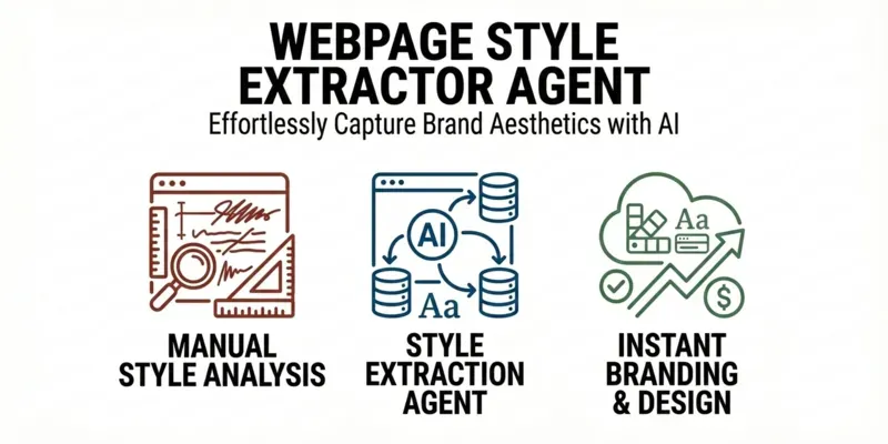
Stop reverse-engineering sites by hand. This prompt opens any webpage and automatically extracts a full design system — colors, typography, spacing, shadows & components — ready to paste into your project..
💡 Perfect for devs who want to clone a visual style, match a client's brand, or bootstrap a design system fast. Works with CSS vars, SCSS, JSON tokens & Tailwind config.
⚠️ Requires Claude in Chrome — the agent opens the page and pulls styles directly.
...more
Added over 1 month ago