

Skill Details
Runtime
Any model
Example user message
[userMessage]: Run the Logo Stress-Test Strategist for: [BRAND_NAME]: Fernway Coffee Co. [BUSINESS_OFFER]: Small-batch coffee roastery selling direct-to-consumer subscriptions and wholesale to independent cafes. [TARGET_AUDIENCE]: Urban professionals aged 25-45 who value quality and provenance over convenience. [BRAND_CHARACTER]: Warm, grounded, honest, unpretentious, dependable.
Example agent response
# Logo Stress-Test Report
## 1. Brand Diagnosis
Core offer: direct-relationship coffee, roasted in small batches.
Audience: quality-driven urban professionals, not convenience buyers.
Desired perception: honest craft over polish.
Competitive tension (design hypothesis): most specialty roasters lean
minimalist-Scandinavian; a warmer, more tactile mark could stand out.
Visual challenge: signal "craft" without sliding into rustic cliché.
## 3. Concept Directions
### Direction A — The Single Bean Cut
Abstract geometric cross-section of a coffee bean, rendered as one
continuous cut line. Symbolic mark family.
Strength: owns the category's core object without using a full bean
illustration. Failure mode: could read as an eye or leaf if the cut
angle is too soft.
### Direction B — Fernway Type Mark
Custom lowercase wordmark with one modified ascender standing in for
a steam curl. Typographic system family.
Strength: works instantly in monochrome and at any size. Failure mode:
loses the "warm" character trait if the modification is too subtle.
### Direction C — Roast Line Emblem
A single horizontal roast-gradient bar behind a compact wordmark.
Material/process metaphor family.
Strength: literal nod to roasting without a cliché bean icon. Failure
mode: gradient bar fails single-color printing (see Stress Test).
## 5. Real-World Stress Test (excerpt)
| Condition | Direction A | Direction B | Direction C |
|---|---|---|---|
| 16-24px favicon | PASS | PASS | FAIL — gradient collapses |
| Single-color print | PASS WITH REVISION | PASS | FAIL |
| Dark background | PASS | PASS | PASS WITH REVISION |
## 7. Weighted Scorecard
| Direction | Brand fit | Distinct. | Small-size | Adapt. | Memor. | Prod. | Longev. | TOTAL |
|---|---|---|---|---|---|---|---|---|
| A | 21/25 | 17/20 | 14/15 | 13/15 | 8/10 | 9/10 | 4/5 | 86/100 |
| B | 23/25 | 14/20 | 15/15 | 14/15 | 7/10 | 10/10 | 5/5 | 88/100 |
| C | 18/25 | 16/20 | 6/15 | 8/15 | 8/10 | 5/10 | 3/5 | 64/100 |
## 8. Verdict
**DEVELOP — Direction B, the Fernway Type Mark.**
Reason it won: highest cross-platform reliability and the only
direction with zero FAIL results on the stress test. Direction A kept
as backup (strong second, more distinctive if B underperforms in
market testing). Direction C rejected as primary — gradient dependency
is a structural production risk, not a polish issue.
[Sections 2, 4, 6, 9, 10 follow the same structure in the full run.]

 Instant access
 Commercial use
 Money‑back
By purchasing this skill, you agree to our terms of service
5.0
1 review
1
Favorites
20
Views


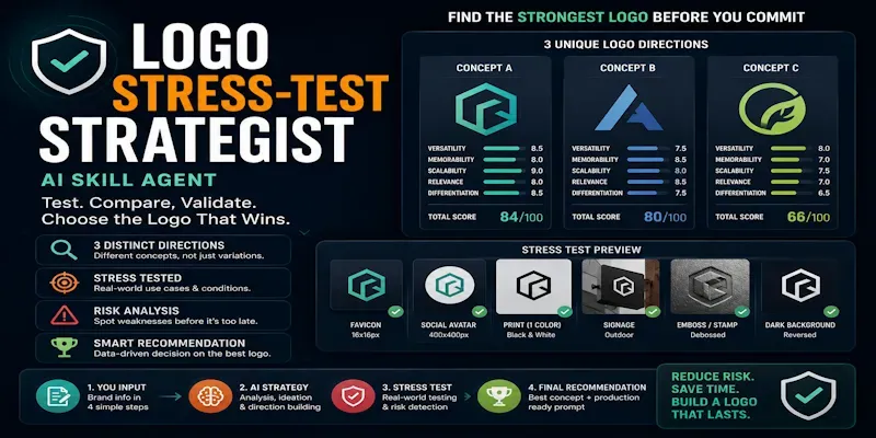
Stop picking a logo because it "looks nice." This skill runs three
distinct concept directions through an adversarial review, a
10-condition real-world stress test (favicon, print, signage, dark
mode), a risk scan, and a weighted scorecard — then delivers one
verdict, a production brief, and a ready-to-use image prompt. Built
for founders and designers who need a decision, not more options.
...more
Added 3 weeks ago

- Reviews for this skill (1)